Progress Indicators
The Enyo framework provides a variety of controls for displaying the progress of an activity. All of these are descendants of the enyo.Progress kind.
enyo.Progress
enyo.Progress is a virtual base class for anything with a range and a position within that range, such as a ProgressBar or Slider.
To create a Progress, do the following:
{kind: "Progress", minimum: 50, maximum: 220, position: 70}
The default values for minimum, maximum, and position are 0, 100, and 0, respectively, so if you create a Progress without specifying values for these properties, it will have a range of 0 to 100, and an initial position of 0.
When the position needs to be updated, call the setPosition method:
madeProgress: function(inValue) {
  this.$.progress.setPosition(inValue);
}
In addition to the aforementioned minimum, maximum, and position, Progress has one other published property, snap. When you call setPosition, the position value you pass in will be rounded to the nearest multiple of the snap value. For example, if you set snap to 5 and then call setPosition(27), the new position will be the multiple of 5 that's closest to 27--that is, 25.
The default value of snap is 1.
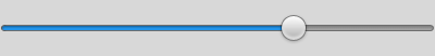
ProgressBar
A ProgressBar is a control that shows the current progress of a process in a horizontal bar. The ProgressBar kind extends enyo.Progress, adding support for animating progress changes. This animation is enabled by default, but you can disable it by setting the animationPosition property to false.
Here's an example of a very simple ProgressBar:
{kind: "ProgressBar", style: "width: 400px", position: 60}

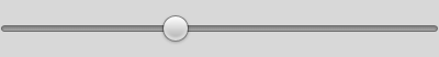
Slider
A Slider is a control that presents a range of selection options in the form of a horizontal slider with a control knob that can be tapped and dragged to the desired location. The Slider kind extends ProgressBar, adding support for setting the position based on user input (i.e., dragging or tapping the bar).
Here's some code that creates a simple Slider:
{kind: "Slider", style: "width: 400px", position: 40,
  onChanging: "sliderChanging", onChange: "sliderChange"}
The onChanging event is fired while the user is dragging the control knob. The onChange event is fired when the position is set, either at the completion of a drag or when the bar registers a tap.
If you want to disable the ability to change position by tapping on the bar, set the tapPosition property to false.
ProgressSlider
A ProgressSlider is a control that combines a Slider and a ProgressBar. The ProgressSlider kind derives from Slider, which, in, turn, derives from ProgressBar.
The position of a progress slider may be changed by the user or by the application.
You may use the lockBar, barPosition, barMinimum, and barMaximum properties to constrain the user's ability to change the position. For example, the following code creates a progress slider that allows dragging between 50 and 70.
{kind: "ProgressSlider", lockBar: true, barMinimum: 50, barMaximum: 70}
Note that barPosition, barMinimum, and barMaximum are only active if the value of lockBar is true. (It is false by default.)
To create a progress slider whose position snaps to multiples of 10, do this:
{kind: "ProgressSlider", lockBar: true, snap: 10}