User Interface Summary
Overview
This page summaries the supported user interface (UI) actions, guidelines for optimal scene functionality, and the building blocks for scenes.
User Expectations
Users learn to operate the device by using its built-in applications. If new applications work similarly and include standard UI controls, users learn how to use them more quickly.
In addition to easy and intuitive operation, users expect applications to have readable text, look great, and operate quickly. You can achieve these goals with the standard UI controls and their default style settings. There are also tools available to further customize the look of the application.
Supported UI Interactions
Users interact with the HP webOS platform by using a finger tip. (A stylus does not work.) The following table lists the supported UI interactions. A "tap" action is a quick press on an element. A "swipe" action is a quick press and drag on an element.
| UI element | Actions |
| Card view |
|
| Gesture area | The Glossary defines the following actions: flick, back, next, previous, Quick Launch, Launch, and meta-tap. |
| Keyboard | Start typing. |
| Keyboard shortcuts |
|
| List |
|
| Text field |
|
| Touch screen |
|
Basic Guidelines for Scenes
This section discusses the following:
- Screen Dimensions
- Screen Modes
- Transitions
- The Application Menu
- Buttons and Menu Commands
- Plan for Interruptions
- Errors
- Launching New Cards
- Saving Data
- Using System Resources
Screen Dimensions
Consider the screen dimensions in the following tables when designing an application for a particular device. If you want the application to respond to rotation changes, set the size of the scene elements so they appear correctly after rotating the device. For more info, see Accelerometer and Canvas Tag Support.
| Pre item | Dimension | Comment |
| Application icon | 64 x 64 pixels (W x H) | |
| Browser URL bar | 50 pixels (H) | |
| Command Menu bar | 50 pixels (H) | Floats above the scene content. |
| Screen, portrait view |
Max. 320 x 480 pixels (W x H) (HVGA) |
Full-screen mode occupies the entire area. |
| Screen, landscape view |
Max. 480 x 320 pixels (W x H) |
Not all apps rotate to landscape view. |
| Header bar, fixed | 50 pixels (H) | Fixed location and floats above the scene content. |
| Header bar, scrolling | Varies | We recommend 50 pixels (H). |
| Notification bar (a) | 28 pixels (H) | Always visible. |
| Notification pop-up | Max. 240 pixels (H), minimizes to 28 pixels (H) | Overlays the scene content. Make as small as possible, never exceeding half the screen height. |
| Phone title bar | 28 pixels (H) | |
| Status bar (a) | 28 pixels (H) | Always visible. |
| View menu | 50 pixels (H) | Floats above the scene content. |
- In Full-screen mode, this item is hidden.
The following table lists the differences between the Pre and Pixi devices.
| Pixi item | Dimension | Comment |
| Screen, portrait view |
Max. 320 x 400 pixels (W x H) (HVGA) |
Full-screen mode occupies the entire area. |
| Screen, landscape view |
Max. 400 x 320 pixels (W x H) |
Not all apps rotate to landscape view. |
Screen Modes
The HP webOS platform includes the following screen modes:
- Default—Shows the entire image, without any cropping.
- Full-screen—Shows a portion of the source frame, but allows the application to fill the entire screen. Full-screen mode hides the Status and Notification bars. However, this mode does not stop pop-up notifications from appearing on the screen.
For more info, see Media Extensions, FilePicker, and Video.
Transitions
Use the following transitions for consistent application operation:
- Cross-fade—Moving to a similar level.
- New Card—Launching another application.
- Zoom In—Moving down a level in the hierarchy.
- Zoom Out—Moving up a level in the hierarchy and moving back (gesture).
The Application Menu
The Application Menu allows you to create special menus that appear in each scene. This is a very powerful concept. The Application menu is a dynamic menu that contains the following menu items by default:
- Edit, which should always be the first menu command
- Preferences & Accounts, if applicable for your application
- Help
Buttons and Menu Commands
For each scene, create a set of command buttons and special commands in the Application menu. Include these items when working through your navigation flow. It helps to determine how many scenes are needed, which actions are needed in each, and how and when to reuse a scene for a common purpose.
Plan for Interruptions
It is common for notifications (e.g., meeting reminder or text message) to appear while using an application. When notifications appear, the HP webOS platform displays them below the application in the notification bar.
Interruptions can ruin the user experience of some applications, such as games. Consider including an auto-pause feature that triggers when receiving a pop-up notification or when the user minimizes the application.
Errors
Report an error when the problem impacts the user experience and the application cannot resolve the issue quickly on its own. Consider the recommendations in the following table.
| Topic | Recommendation |
| Banner notification | Use this location when the user only needs to know about the problem, but does not need to take action. |
| Dialog panel |
Use this location when the application cannot continue without a decision by the user. When writing the message and naming the buttons, remember to phrase the message as concisely as possible so the user understands the issue and what actions they can take. Also, avoid the word "please," negative phrases (e.g., "invalid account" or "wrong password"), and technical phrases (e.g., "server error" or "timed out"). A good example is "Try again." Provide buttons that make it simple to take corrective actions. Use verbs or phrases for the button titles that correspond directly to the language used in the message. If any of the actions are destructive, use the "destructive" button style and provide a CANCEL button. |
| Inline message | Use this location to show an error alert icon and a message in the scene, under the tapped item that generated the problem. If multiple items contribute to the problem (e.g., incorrect username and password), show a single message summarizing how the user can correct the problem. |
Launching New Cards
Sometimes a user needs to open multiple cards to collect information before continuing with an application, such as when composing an email message. Consider this situation when designing the scenes and workflow for your application. Because each card requires additional device resources, try to launch new cards only when necessary.
Saving Data
We recommend that you use autoSave when the user edits:
- A value in one field and then taps into another.
- A value and then performs the back gesture.
- A value, minimizes the app to a card, and then exits the application.
Using System Resources
With the HP webOS platform, you can now run multiple applications. Therefore, it is important that each application uses the system resources wisely and efficiently. For example, if an application needs an almost continuous connection to the network, poll the network only when the application is maximized and in use.
Common Scene Elements
All scenes contain the elements listed in the following table. Their locations are shown in the figure after the table.
| Element | Description |
| Application Menu | Appears on the left side of the Status bar with an upside-down triangle when the current scene has other available actions. You can add new commands in each scene. |
| Status Bar | Appears at the top of each scene, and displays the Application menu button, local time, signal strength, and battery power. |
| Header Area | Optional; fixed or scrolling. Displays the scene's title and any other controls affecting the view. |
| Scroll View | Displays the scene's UI controls or information needed, and allows scrolling up and down. |
| Command Menu Area | Optional. Displays Command buttons at the bottom of the scene. These buttons are always visible, and trigger the scene's most important actions. |
| Notification Bar | Appears at the bottom of the display when a background application posts a notification, moving the application up 28 pixels. Remember to consider the occasional appearance of the notification bar when designing an application. |
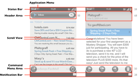
Figure: Basic Elements of a Scene