Buttons
CustomButton
While there are many button-like kinds in the Enyo framework, nearly all of them (including Button itself) are descended from CustomButton.
A CustomButton is a button without any visual treatment. It should be used when a button primitive with unique appearance is desired. Typically, a CSS class is specified via the className property.
Initialize a CustomButton as follows:
{kind: "CustomButton", caption: "OK", className: "myButton", onclick: "buttonClick"}
Published Properties
CustomButton implements mouse handling for a well-defined set of states, as evidenced by the following table of published properties.
| Name | Default | Description |
| caption | "" | Determines what text (if any) is displayed inside the button. |
| disabled | false |
Set to true to disable the button.
|
| isDefault | false |
Set to true to make this button the default choice.
|
| down | false |
Is automatically set to true when the button is in a "mouse down" state. Resets to false on "mouse up" or "mouse out".
|
| depressed | false |
Is automatically set to true if toggling is enabled AND the button is toggled into the down state. Resets to false when button is toggled again.
|
| hot | false |
Is automatically set to true when the button is in a "hot" state--i.e., the user is "mousing over" it. Resets to false on "mouse out".
|
| toggling | false |
Set to true to create a button with toggling behavior (down when clicked and up when clicked again).
|
| allowDrag | false |
Set to true to allow dragging behavior on the button.
|
Button
The Button kind extends CustomButton, adding default Enyo visual styling.
The following kind illustrates the difference between an unstyled CustomButton and a standard Button:
enyo.kind({
  name: "MyApps.Sample",
  kind: "enyo.VFlexBox",
  style: "width: 400px; padding: 5px",
  components: [
      {kind: "CustomButton", caption: "unstyled (CustomButton)",
          onclick: "buttonClick"},
      {kind: "Button", caption: "styled (Button)", onclick: "buttonClick"}
  ],
  buttonClick: function() {
      // respond to click
  }
});
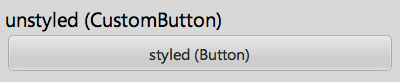
Both buttons call buttonClick successfully, but with no CSS classes applied, the CustomButton provides no visual feedback when clicked.
Enyo has numerous kinds that derive from Button. Let's look at one example, the popular IconButton.
IconButton
An IconButton is a button with Enyo styling, an optional image inside the button, and an optional text caption below it.
Here's a simple example:
{kind: "IconButton", caption: "right on", icon: "images/menu-icon-forward.png"}
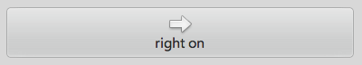
The icon property specifies either the path to the image file or, if the iconIsClassName property is set to true, the name of a CSS class to be applied to the button. (iconIsClassName is false by default.)
Several widely-used button kinds derive directly from IconButton, including ToolButton, which is used inside of Toolbars, and RadioButton, which we will discuss in more detail.
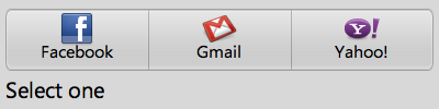
RadioButton
In Enyo, a RadioButton is an IconButton designed to go inside a RadioGroup (a horizontally-oriented group of buttons in which tapping on one button will release any previously-tapped button). The radio button's value property identifies it within in the group. If value is not set, the index of the button is used.
Here's an example of a components block that includes a RadioGroup:
components: [
  {kind: "RadioGroup", name: "myGroup", onclick: "myGroupClick",
      components: [
          {caption: "Facebook", icon: "images/facebook-32x32.png",
              value: "facebook"},
          {caption: "Gmail", icon: "images/gmail-32x32.png",
              value: "gmail"},
          {caption: "Yahoo!", icon: "images/yahoo-32x32.png",
              value: "yahoo"}
      ]
  },
  {name: "statusText", content: "Select one"}
]
Note that there is one handler method (myGroupClick) for the entire RadioGroup. When a button is clicked, that button is passed as the first argument to the handler, so we can identify the button by checking its value property:
myGroupClick: function(inSender, e) {
  this.$.statusText.setContent("Current selection: " + inSender.getValue());
}
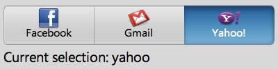
If we had not set the value property for the originating button, inSender.getValue() would have returned "2" instead of "yahoo".