Menus
Menu
A Menu is a control that displays a set of items in a popup. The Menu kind derives directly from enyo.Popup.
{kind: "Menu"}
Items may be specified as child components of the menu:
{kind: "Menu", components: [
  {caption: "Palm"},
  {caption: "Yahoo"},
  {caption: "Facebook"}
]}
Items may also be set using the setItems method:
this.$.menu.setItems(["Palm", "Yahoo", "Facebook"]);
By default, items are created as instances of MenuItem, but you can change this behavior by setting the defaultKind property. For example, you could create a menu whose items are MenuCheckItem objects:
{kind: "Menu", defaultKind: "MenuCheckItem"}
Being derived from the Popup kind, menus inherit the positioning methods available to popups, such as openAtCenter:
openMenu: function() {
  this.$.menu.openAtCenter();
}
In addition, Menu has a published property called autoCloseSubItems. The default value is true, meaning that whenever the menu is opened, any subitems will be shown as closed.
MenuItem
A MenuItem is a labeled item with an optional icon. It is meant to go inside a Menu.
When clicked, a menu item fires an onclick event.
Published Properties
The following table summarizes the published properties of the MenuItem kind.
| Name | Default | Description |
| caption | "" | Caption to display for the menu item |
| value | undefined | Value associated with the menu item |
| icon | "" | Filename for optional icon |
| orderStyle | "" | CSS style to apply to menu item |
| open | false |
If true, menu item is shown in expanded (non-collapsed) state.
|
| disabled | false |
If true, menu item is disabled.
|
| hideIcon | false |
If true, icon is hidden.
|
| tapHighlight | true |
If true, item is highlighted when tapped.
|
MenuCheckItem
The aforementioned MenuCheckItem extends MenuItem, adding a checkmark to the labeled item with icon.
To display the checkmark, set the checked property to true.
AppMenu
An AppMenu is an application menu that appears in the upper-left corner of the screen when the user taps the left-hand side of the status bar.
The AppMenu kind extends Menu; by default, its items are instances of AppMenuItem.
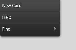
Here's an example of a menu with two items and a submenu:
{kind: "AppMenu", components: [
  {caption: "New Card", onclick: "openNewCard"},
  {caption: "Help", onclick: "showHelpContent"},
  {caption: "Find", components: [
      {caption: "Find Next"},
      {caption: "Find Prev"}
  ]}
]}
To signal that the app menu should be shown, an openAppMenu event is fired to the application. When it should be hidden, a closeAppMenu event is fired. An application should implement methods to respond to these events as follows:
openAppMenuHandler: function() {
  this.$.appMenu.open();
},
closeAppMenuHandler: function() {
  this.$.appMenu.close();
}
The menu opens automatically, provided that its automatic property is set to the default value, true.
AppMenuItem
The AppMenuItem kind extends MenuItem, applying specialized visual styling.
EditMenu
EditMenu, which extends AppMenuItem, is a submenu designed to go inside a Menu, with items to perform select all, cut, copy, and paste operations. The onSelectAll, onCut, onCopy, and onPaste events are fired when the respective items are selected.
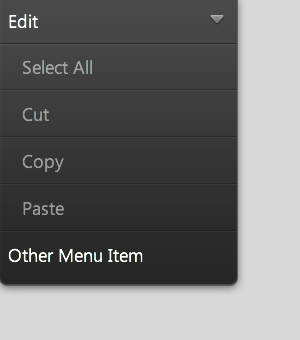
{kind: "AppMenu", components: [
  {kind: "EditMenu"},
  {caption: "Other Menu Item"}
]}
In its open state, the EditMenu looks like this:
If the autoDisableItems property is set to true (its default value), the edit menu's items will be automatically disabled if the focused element does not support editing. This setting will override the disabled properties of individual items.
EditMenu has additional properties that, if set to true, will disable the text operations individually (selectAllDisabled, cutDisabled, copyDisabled, and pasteDisabled). All of these default to false.
HelpMenu
Like EditMenu, HelpMenu is a specialized AppMenuItem. As such, it is designed to go inside an AppMenu.
HelpMenu should be used by applications to initiate the display of help content. Returning to our earlier AppMenu example, the addition of a HelpMenu obviates the need for a separate showHelpContent method:
{kind: "AppMenu", components: [
  {caption: "New Card", onclick: "openNewCard"},
  {kind: "HelpMenu", target: "http://help.palm.com/phone/index.html"},
  {caption: "Find", components: [
      {caption: "Find Next"},
      {caption: "Find Prev"}
  ]}
]}
Note that this change does not have any effect on the app menu's outward appearance.