Headers
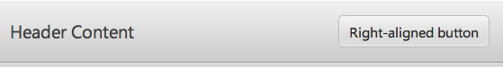
Header
A Header is a styled control fitting across the top of the application region.
Textual content for a Header may be specified via the content property:
{kind: "Header", content: "Header Content"}
Controls may be placed inside a Header by defining them in a components block:
{kind: "Header", components: [
  {content: "Header Content", flex: 1},
  {kind: "Button", caption: "Right-aligned button"}
]}
PageHeader
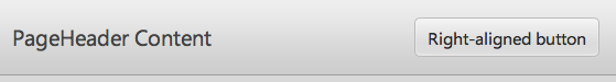
The Enyo framework also contains a separate PageHeader kind, which is derived directly from Header. In Enyo version 1.0, the two kinds are identical in both appearance and functionality.
{kind: "PageHeader", components: [
  {content: "PageHeader Content", flex: 1},
  {kind: "Button", caption: "Right-aligned button"}
]}