Dialogs
Dialog
A Dialog is a container that displays a set of controls over other content. It attaches to the bottom of the screen and, when shown, animates up into view from that position.
The Dialog kind inherits from enyo.Toaster, which in turn inherits from enyo.Popup.
A Toaster is a Popup with the ability to animate into view from any one of the four edges of the screen. The starting position of the toaster is determined by the value of its flyInFrom property. Possible values are left, right, top, and bottom, with bottom being the default.
A Dialog is functionally equivalent to a Toaster with flyInFrom set to bottom; they differ in that the dialog has additional visual styling applied.
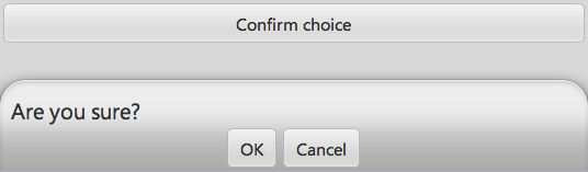
For example, the following kind uses a dialog to ask the user to confirm a choice:
enyo.kind({
  name: "MyApps.Sample",
  kind: "enyo.VFlexBox",
  components: [
      {kind: "Button", caption: "Confirm choice", onclick: "showDialog"},
      {kind: "Dialog", components: [
          {content: "Are you sure?", style: "padding-left: 10px"},
          {layoutKind: "HFlexLayout", pack: "center", components: [
              {kind: "Button", caption: "OK", onclick: "confirmClick"},
              {kind: "Button", caption: "Cancel", onclick: "cancelClick"}
          ]}
      ]}
  ],
  showDialog: function() {
      this.$.dialog.open();
  },
  confirmClick: function() {
      // process confirmation
      this.doConfirm();
      // then close dialog
      this.$.dialog.close();
  },
  cancelClick: function() {
      this.$.dialog.close();
  },
  doConfirm: function() {
      // confirm things
  }
});
Here's what you'll see after pushing the "Confirm choice" button:
ModalDialog
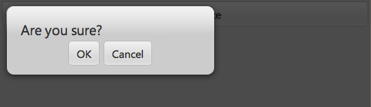
A ModalDialog is a fixed-width Popup with a header. It is meant to be used as an interactive dialog box. Its modal property defaults to true, so once a modal dialog is displayed, the rest of the device UI is inaccessible until the user dismisses the dialog. (In this regard, bear in mind that for modal dialogs, the dismissWithClick property defaults to false).
Unlike Dialog, ModalDialog does not inherit from Toaster, but is derived directly from Popup.
Here's what our example kind looks like if we replace the dialog with a modal dialog:
enyo.kind({
  name: "MyApps.Sample",
  kind: "enyo.VFlexBox",
  components: [
      {kind: "Button", caption: "Confirm choice", onclick: "showDialog"},
      {kind: "ModalDialog", components: [
          {content: "Are you sure?", style: "padding-left: 10px"},
          {layoutKind: "HFlexLayout", pack: "center", components: [
              {kind: "Button", caption: "OK", onclick: "confirmClick"},
              {kind: "Button", caption: "Cancel", onclick: "cancelClick"}
          ]}
      ]}
  ],
  showDialog: function() {
      this.$.modalDialog.open();
  },
  confirmClick: function() {
      // process confirmation
      this.doConfirm();
      // then close dialog
      this.$.modalDialog.close();
  },
  cancelClick: function() {
      this.$.modalDialog.close();
  },
  doConfirm: function() {
      // confirm things
  }
});