Drawers
Drawer
A Drawer is a control with a label (caption), which animates vertically to open and close. The drawer may be opened by calling setOpen(true) or just open; it may be closed by calling setOpen(false) or just close. You may also toggle the open/closed state by calling toggleOpen.
Here's a kind that implements a simple drawer with a button that toggles the state:
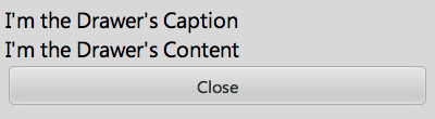
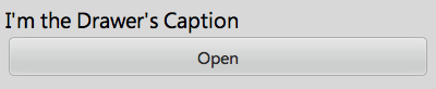
enyo.kind({
  name: "MyApps.Sample",
  kind: "enyo.VFlexBox",
  style: "width: 400px; padding: 5px",
  components: [
      {kind: "Drawer", caption: "I'm the Drawer's Caption", components: [
          {content: "I'm the Drawer's Content"},
      ]},
      {kind: "Button", caption: "Close", onclick: "toggleDrawer"}
  ],
  toggleDrawer: function() {
      this.$.drawer.toggleOpen();
      if (this.$.drawer.open) {
          this.$.button.setCaption("Close");
      } else {
          this.$.button.setCaption("Open");
      }
  }
});
Initial (open) state:
Closed state:
Published Properties
Each Drawer object has the following published properties:
| Property | Default | Description |
| open | true | Specifies whether the drawer should be open. |
| canChangeOpen | true |
Controls whether or not the value of the open property may be changed.
|
| animate | true |
Set to false to avoid animations when the open state of the drawer changes.
|
| captionClassName | "" | CSS class to apply to the drawer caption |
| caption | "" | Caption to display above drawer content |
Published Events
The Drawer kind has two published events--onOpenChanged, which fires when a drawer opens or closes, and onOpenAnimationComplete, which fires when a drawer animation completes.
DividerDrawer
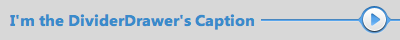
The DividerDrawer kind, which derives directly from enyo.Drawer, defines a drawer whose caption is styled to look like a divider. The open state is indicated by an arrow button.
Here's the caption from a divider drawer in the open state...
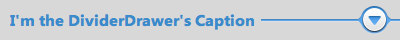
...and in the closed state: