Flex Layouts
In Enyo, any Control object may contain other controls. Generally the contained controls are emitted directly as HTML based on their properties, but controls may also use Layout objects to enhance the rendering of their child controls. You can enable layout by specifying a value for the layoutKind property, e.g.:
{name: "someContainer", layoutKind: "VFlexLayout"}
This layout system is very general, but flex layouts are so common and so important that they're worth discussing in detail.
Basics
Flex layouts are based on the CSS3 Flexible Box Model. There are some slight differences, but most of the terminology matches the standard.
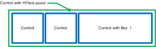
HFlexLayout and VFlexLayout both extend the FlexLayout kind. An HFlexLayout displays controls in horizontally-stacked boxes, from left to right, while a VFlexLayout displays controls in vertically-stacked boxes, from top to bottom.
You will see many examples that use the VFlexBox and HFlexBox kinds. Both are simply controls that have layoutKind set by default (layoutKind: enyo.VFlexLayout and layoutKind: enyo.HFlexLayout, respectively).
Confusion often arises as to where (i.e., to which objects) layout should be applied. Remember that layouts are assigned to containers, or outer objects, not to the objects that are subject to layout.
Flex layouts are particularly useful for designs that need to fit objects to spaces. For example, if you have a header, middle section, and footer, and you want the header and footer to be always visible, with the middle section taking up the remaining space.
Note: Traditional HTML is not good at dealing with this kind of structure. In HTML, the sizing of objects generally proceeds from the inside out--i.e., the size of a container is determined by the size of the objects it contains. So the HTML paradigm is, in a way, the opposite of fitting objects to a fixed space. (This dichotomy in the approach to layout is something that comes up regularly in discussions of Web-centric vs. desktop-centric applications.)
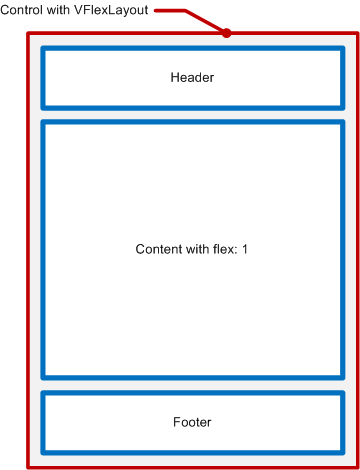
In the above diagram, note that the container itself has VFlexLayout, but the content section has a flex property value. The flex value tells the layout how to size that particular object in the layout.
Properties
flex
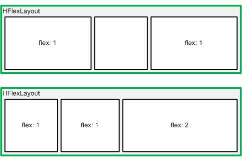
Flex is similar to percent sizing, except that the calculations are based on available space (not total space), and that flex is relative. For example, in an HFlexLayout, a child with a flex of 2 is generally twice as wide as a child with a flex of 1.
Conversely, in a VFlexLayout, a child with a flex of 2 is generally twice as tall as a child with a flex of 1.
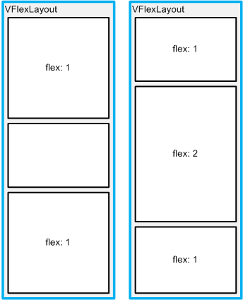
At first, flex may seem less intuitive than percent, but it turns out to be much easier to work with in actual practice. Consider a situation in which you need to divide a space into three equal sections. With flex, you can do this simply by giving each section flex: 1. Using percent, you would have to use 33%, 33%, and 34%, or else deal with leftover pixels.
Flex also makes it easier to add children without having to recalculate spacing. Continuing with our hypothetical example, you could turn three equal sections into four equal sections by just adding another child with flex: 1.
pack
Containers with flex layouts support some other useful properties. For example, the pack property specifies how objects are positioned along the main axis.
In particular, notice that pack: "center" can be used for vertical aligning, which otherwise can be very difficult to achieve.
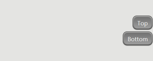
For example, this code creates a a set of vertically-centered buttons positioned at the right edge of the container:
{kind: "Control", layoutKind: "VFlexLayout",
  style: "width: 500px; height: 200px;",
  pack: "center", align: "end", components: [
      {kind: "Button", caption: "Top"},
      {kind: "Button", caption: "Bottom"}
  ]
}
align
The align property is similar to pack, but controls positioning along the orthogonal axis (i.e., along the horizontal axis in a VFlexLayout, or along the vertical axis in an HFlexLayout).
For example, this code creates a a set of horizontally-centered buttons positioned at the top of the container:
{kind: "Control", layoutKind: "HFlexLayout",
  style: "width: 500px; height: 100px;",
  pack: "center", align: "start", components: [
      {kind: "Button", caption: "Left"},
      {kind: "Button", caption: "Right"}
  ]
}

Note: It can be hard to remember which axis is which, but this is the standard naming.