Popups
A popup is a set of floating elements embedded directly within the page context. It can open ("pop up") at a specified position, and has support for modality and for clicking to dismiss.
Opening a Popup
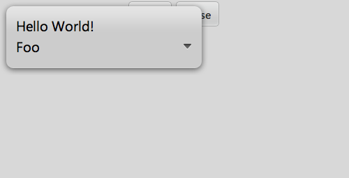
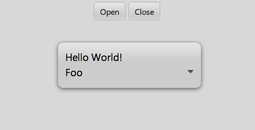
Here's an example of a components block that implements a simple popup:
components: [
  {kind: "Popup", components: [
      {content: "Hello World!"},
      {kind: "ListSelector", value: "Foo", items: ["Foo", "Bar", "Bot"]}
  ]},
  {kind: "Control", layoutKind: "HFlexLayout",
      style: "width: 500px; height: 100px;",
      pack: "center", align: "start", components: [
          {kind: "Button", caption: "Open", onclick: "openPopup"},
          {kind: "Button", caption: "Close", onclick: "closePopup"}
      ]
  }
]
To open the popup in the default position (in the top-left corner of the screen), we can simply call the popup's open method:
openPopup: function(inSender, inEvent) {
  this.$.popup.open();
}
To open the popup centered onscreen, we can do the following:
openPopup: function() {
  this.$.popup.openAtCenter();
}
(Note: In addition to openAtCenter(), the Popup kind has several other methods that let you control where the popup appears when first opened. More details are available in the API reference.)
Closing a Popup
You may close a popup programmatically by calling the close method. For instance, in our current example, we can define closePopup like so:
closePopup: function(inSender, inEvent) {
  this.$.popup.close();
}
In addition, if the dismissWithClick property is set to true (default) and the modal property is false (also default), then clicking anywhere outside the popup will dismiss the popup. (The dismissWithClick and modal properties are not published, but you may set their values when declaring the popup in a components block.)
If modal is set to true, when the popup is displayed, the user will not be able to access the rest of the device UI until the popup is dismissed.
Published Properties
showHideMode
The showHideMode property controls how the popup will be shown and hidden:
| Value | Behavior |
| auto |
When open and close are called, the popup will be shown and hidden.
|
| manual |
When open and close are called, the popup will not be shown or hidden. Use this mode when controlling the popup via custom animation.
|
| transition |
The popup will be shown when open is called and hidden when a CSS transition completes. Use this mode when animating via CSS transitions.
|
The default value of showHideMode is auto.
openClassName
The openClassName property may be used to specify the name of a CSS class that will be applied to the popup when it is opened.
Technical Notes
As of Enyo 0.10, the contents of all popups are created lazily by default. The Popup kind descends from LazyControl, which (optionally) defers creation of its components when its lazy property is set to true. A popup will automatically instantiate its contained components before it is opened for the first time. This is done by calling the validateComponents method. It is not necessary for you (the app developer) to call this method.
To make adjustments to controls within the popup before display, instances of Popup should handle the onBeforeOpen event. This event is fired after the contained components are created, but before the popup is opened.
Kinds that are based on Popup should defer initialization of sub-components by using the componentsReady method for initialization instead of the create method. Any published properties that need to interact with components should check for the existence of those components before doing so. You may check whether components have been initialized by testing the value of the lazy property (if true, then components are not yet available). In addition, you can forcibly ensure that components exist by calling validateComponents.
Finally, you may specify non-lazy behavior for any given popup by setting its lazy property to false.