Sliding Panels
SlidingPane
A SlidingPane is a control designed to present a horizontal layout of SlidingView controls, which are panel controls that can slide one on top of another. The user can drag the views left and right and they'll stay connected. If a view is moved to the far left, it will cover any views to the left of it.
Sliding views can have explicit width or be flexed. In either case, they are displayed in a sliding pane's client region, which is an HFlexBox. The view on the far right is special -- it will always behave as flexed unless its fixedWidth property is set to true.
SlidingPane exposes the same selection methods as Pane. The selected view is the one displayed at the far left of the group.
SlidingPane also has two layout modes -- the normal layout, in which views are placed left-to-right, and a narrow layout, in which views are stacked, taking up the entire width of the sliding pane. A sliding pane can automatically toggle between these layouts if its resize method is hooked up to respond to window resizing. The multiViewMinWidth property has a default value of 500 and is the pivot point between the two layouts.
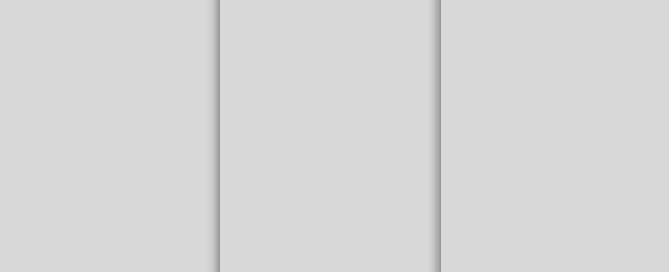
Here's an example of a simple SlidingPane using the normal layout:
{kind: "SlidingPane", flex: 1, components: [
  {name: "left", width: "200px"},
  {name: "middle", width: "200px", peekWidth: 68},
  {name: "right", flex: 1, onResize: "slidingResize"}
]}
SlidingView
A SlidingView is a view that slides back and forth and is designed to be a part of a SlidingPane.
SlidingView objects have a dragAnywhere property, whose default value is true. This allows the user to drag the view from any point inside the panel that is not already a draggable region (e.g., a Scroller). If dragAnywhere is set to false, then the view can still be dragged via any control inside it whose slidingHandler property is set to true.
The peekWidth property specifies the amount the pane view should be offset from the left when it is selected. This allows controls on the underlying view object to the left of the selected one to be partially revealed.
SlidingView has some other published properties that are less frequently used. The minWidth property specifies a minimum width for view content, and edgeDragging lets the user drag the view from its left edge. (The default value of edgeDragging is false.)
The last view in a sliding pane is special, in that it is resized to fit the available space. The onResize event is fired when this occurs.
Published Properties
| Name | Default | Description |
| dragAnywhere | true |
If true, allows the panel to be dragged from anywhere. Note that this will not work if there's another drag surface (e.g., a scroller).
|
| edgeDragging | false |
If true, allows the panel to be dragged from its left edge.
|
| fixedWidth | false |
If false, content width is adjusted based on size changes.
|
| minWidth | 0 | Minimum content width |
| peekWidth | 0 | Distance (in pixels) that the pane view should be shifted to the right (revealing the panel underneath) when selected. |
| dismissible | false |
If true, the view may be dragged to the right to dismiss it.
|