Groups
Group
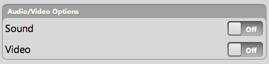
A Group is a container used to display multiple controls visually grouped together. You may use the optional caption property to provide a description of the group.
{kind: "Group", caption: "Audio/Video Options", style: "width: 500px",
  components: [
      {kind: "HFlexBox", align: "center", style: "padding: 5px", components: [
          {content: "Sound", flex: 1},
          {kind: "ToggleButton"}
      ]},
      {kind: "HFlexBox", align: "center", style: "padding: 5px", components: [
          {content: "Video", flex: 1},
          {kind: "ToggleButton"}
      ]}
  ]
}
RowGroup
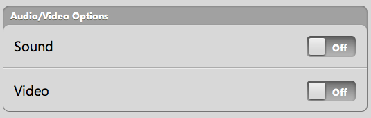
The RowGroup kind derives directly from enyo.Group. A RowGroup is a Group in which each control is automatically treated as a RowItem object, with small guide lines appearing between items.
If we implement the previous example as a RowGroup...
{kind: "RowGroup", caption: "Audio/Video Options", style: "width: 500px",
  components: [
      {kind: "HFlexBox", align: "center", style: "padding: 5px", components: [
          {content: "Sound", flex: 1},
          {kind: "ToggleButton"}
      ]},
      {kind: "HFlexBox", align: "center", style: "padding: 5px", components: [
          {content: "Video", flex: 1},
          {kind: "ToggleButton"}
      ]}
  ]
}
...the visual difference is readily apparent:
RowGroups also differ from Groups in that they have access to methods for showing (showRow) and hiding (hideRow) the row at a given index.